Designing Equilibria's Subscription Page & Creating a Account Dashboard
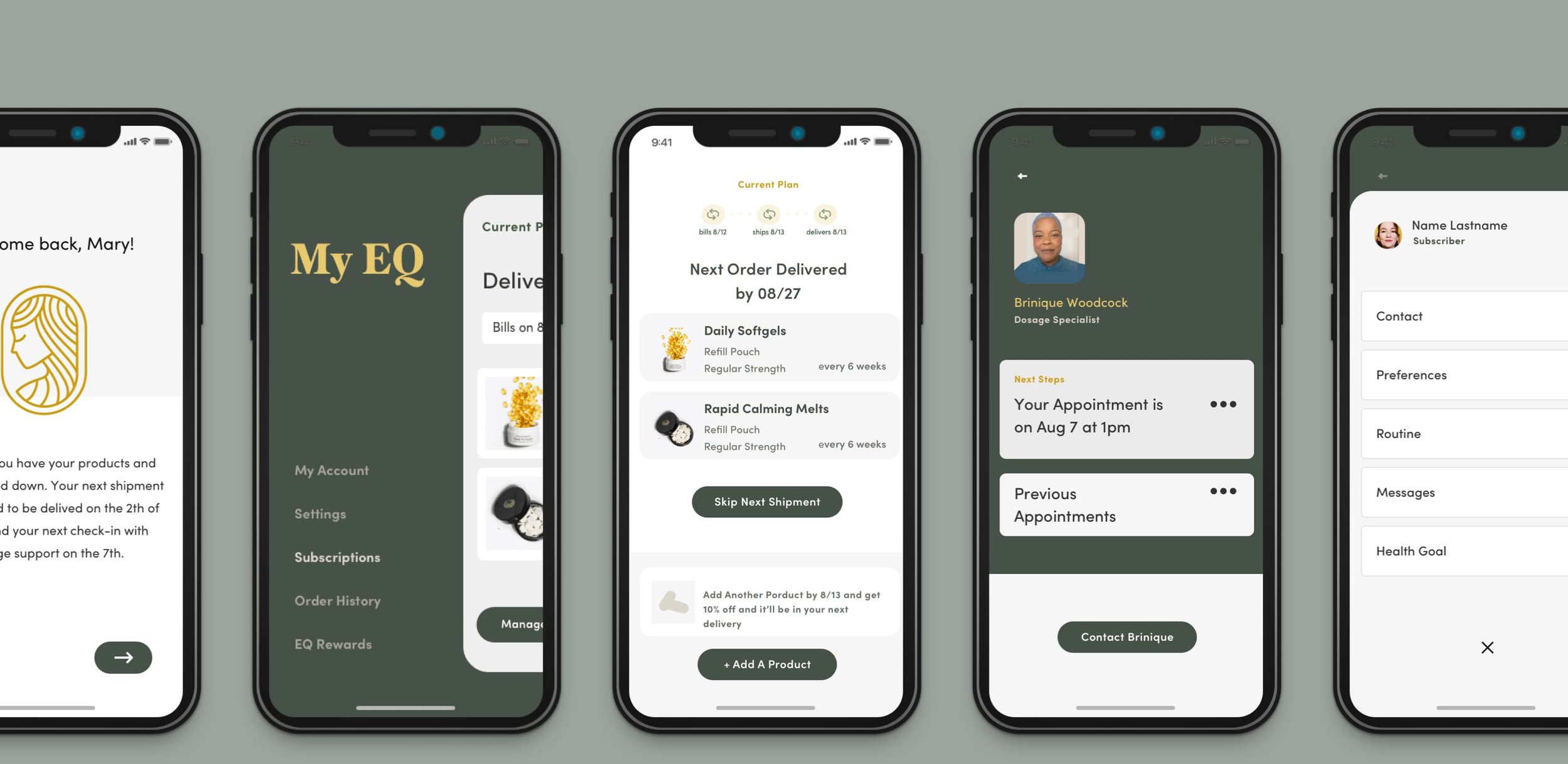
Equilibria (EQ) is a women-focused, CBD company with a dedicated team for 1-on-1 personalized dosage support. My objective was to streamline the subscription page, which lead to a creation of a whole new account portal for new and existing users. Affinity mapping and establishing new and existing user flows helped drive my decisions for new features for a scalable user friendly account dashboard. My high level design goals for the mobile web experience was to keep it modular so that my scalable designs would transition seamlessly into a mobile app.
Process involved:
Understand the Pain-Points, UX Research, Affinity Mapping, User Flows, Competitive Analysis, High-Def Mocks, Global UI Updates, Design Direction
Design goals (high-level):
Improve mobile web usability. Decrease the number of canceled subscriptions due to member frustrations. Scalable user friendly design that will resonate and establish trust.
Design & Productivity Tools:
Figma, Principle, and Notion

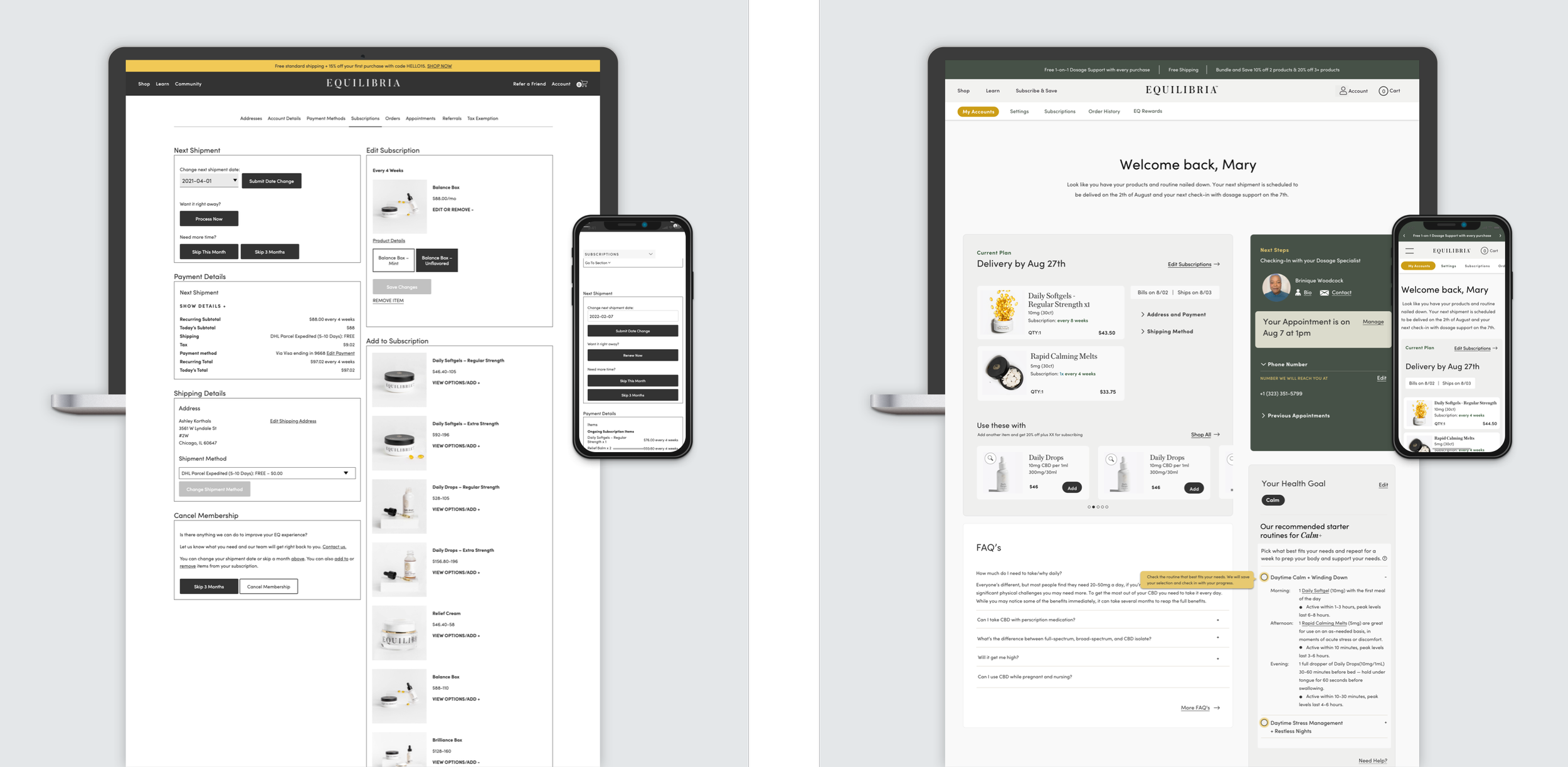
Prior to Revamping
My Final Iteration
Understanding customer goals
My role was to understand the pain-points by doing UX research, customer interviews, customer service workshops, and excessive auditing. This gave me a better understanding of the various goals for different customer segments. It also helped determine the types of content that the design system will need to support. Hypothesis based on gatherings was to prioritize discoverability, schedule dosage consultation calls and the ease of editing subscriptions. A better navigation, clearly defined sections with headers/ sub with color blocks, UI consistency and less content density on the page.

Thought Process / High level Goals
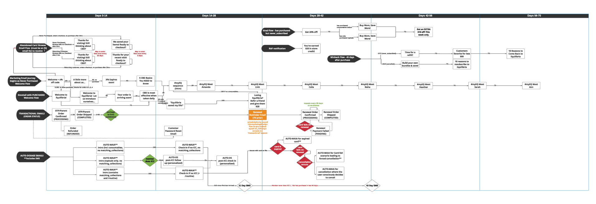
Actions: What does the customer click on? Touchpoint: What part of the service do they interact with? Customer Relationship: What is the customer/user thinking and feeling in relation to EQ? Opportunities: How can we make subscribers stay engaged with our digital product?

Iterative design
Actions: What does the customer click on? Touchpoint: What part of the service do they interact with? Customer Relationship: What is the customer/user thinking and feeling in relation to EQ? Opportunities: How can we make subscribers stay engaged with our digital product?

What do we have now? What we want to build and what do we want to build later?
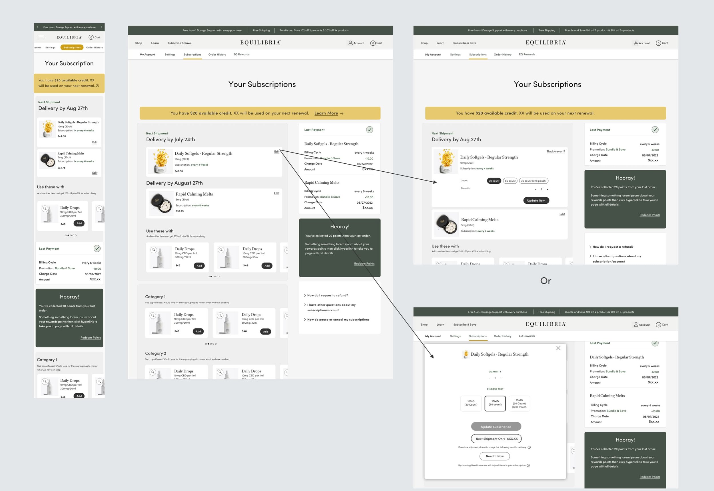
Conducting A/B testing, surveying and prototype testing my initial designs with subscribers and company employees helped gather more learns for another, stronger design pass that solve business and user goals. Highlighting areas such as: sub nav options as an alt to secondary side nav to build a structure that allows us to grow. Consolidating tabs and introducing new pages for clearer communication. UI changes that should influence global styling for better mobile use that will transition to mobile app. A place to opt into content so that the user stays engaged and for better retention.

Next Project