Introducing Quiz and iterating Equilibria's Checkout Flow
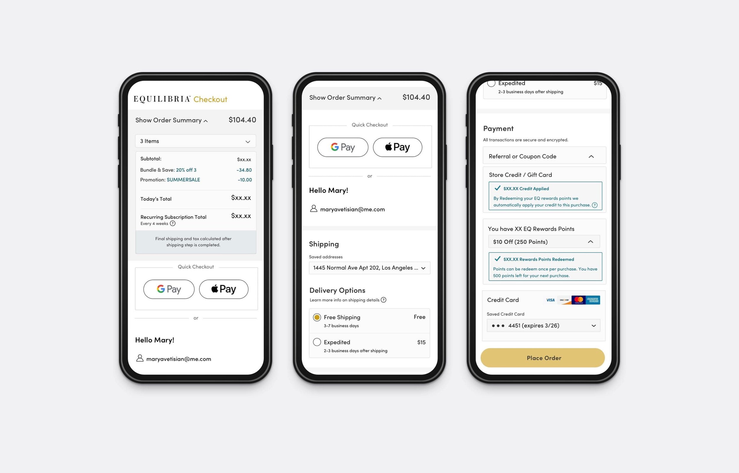
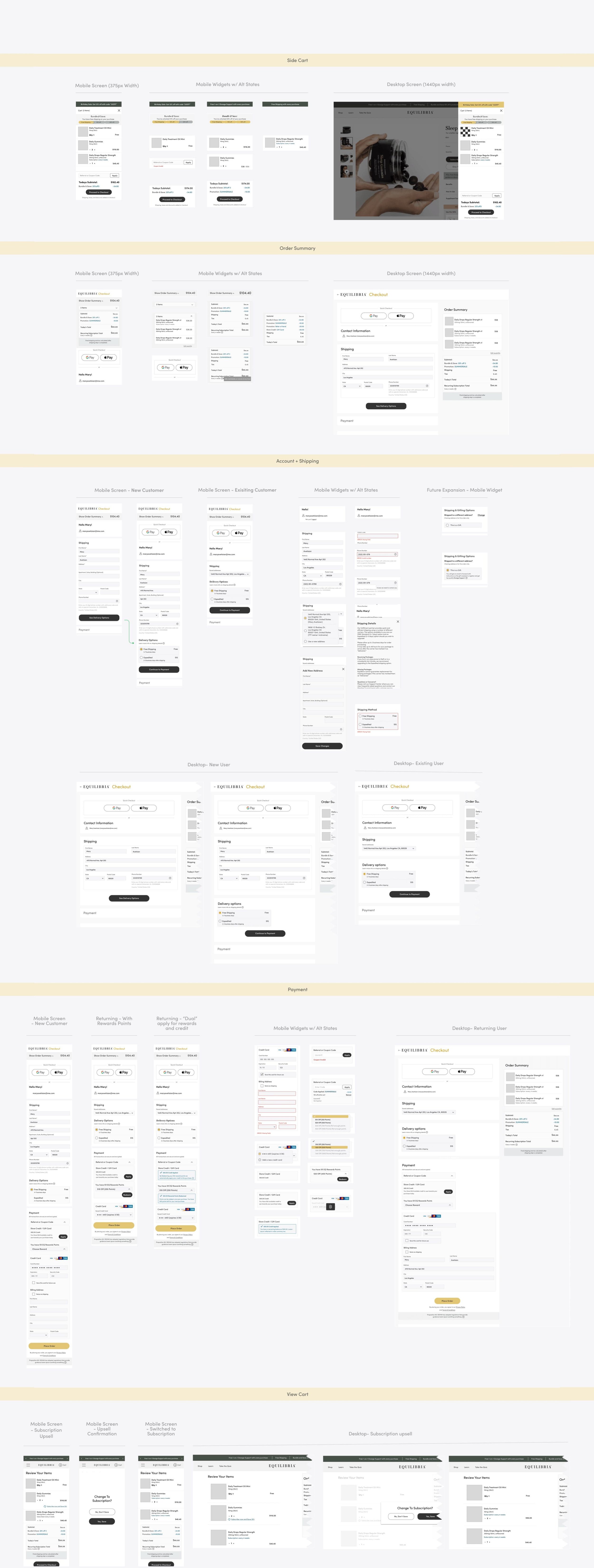
Equilibria (”EQ”) is a high-growth, omni-channel premium CBD platform for women. As my first growth project I set out to achieve business goals, by introducing an EQ quiz for new customers. This was the pathway to further personalization features and UX improvements such as as second iteration on EQ’s checkout flow. I worked on breaking up our multi-step one-pager into a multi-page modularized checkout process will remove existing distractions and confusion. And anything else that will take the customer away from completing their purchase. Therefore, increase usability overall, but especially for mobile.
Process involved:
Competitive Analysis, User Flows, Wire Framing, User Research, Visual Design, High-Def Mocks, Art Direction
Design goals (high-level):
Improve mobile web usability. Error and success messaging for a Section-by-section verification process. Seamless input fields, dropdown widgets, accordions and pop ups
Design & Productivity Tools:
Sketch, Zeplin, Invision and Notion

Personalization to better understand EQ’s audience.
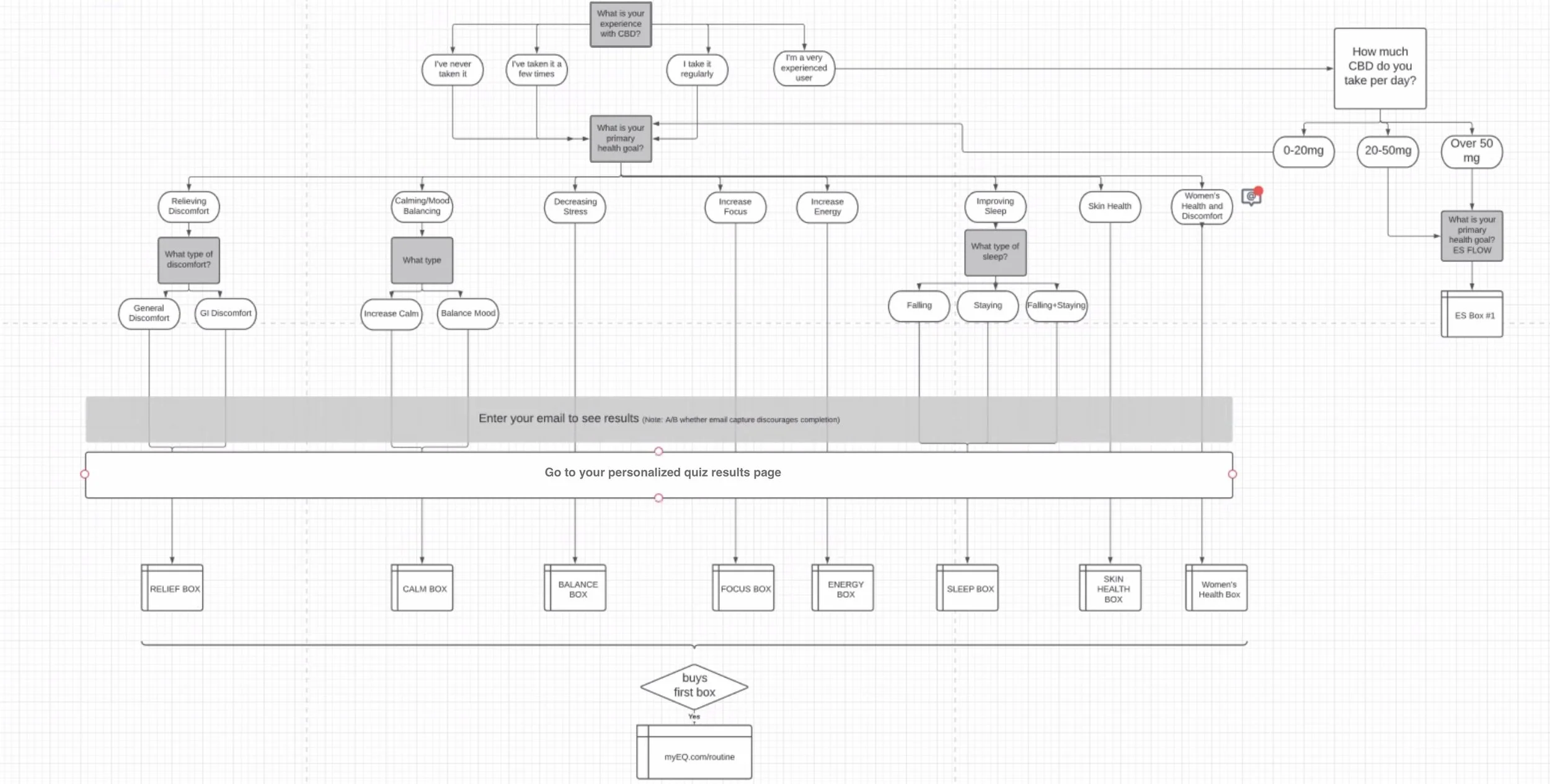
I focused on getting to understand our audiences' needs with a mini personalization project. To start I fleshed out a member journey map with all the guided selling and service touch points then mapped out all the routine permutations for the quiz results.

Customer/Member Journey Map

Quiz Routines Map
The quiz helped determine the optimal layout, content, and functionality of the website. The results and post purchase “routine’s page” provided the visitor with a suggested daily routine to be accompanied with a 1-on-1 dosage call with EQ’s highly qualified dedicated dosage counselors. Guiding visitors to a well designed experience on the site was a good test and a nice quick win for the product + dev department. It increased conversion and retention by 12%. In addition to helping achieve business goals, the quiz was the pathway to further personalization features and UX improvements.

Using metrics and data to justify UI/UX decisions.
GA’s funneled segments to track quiz performance showed that 10.85% of new visitors to the site started and converted. 13.73% of new users completed and converted with an AOV of This was more than the quarterly 5.56% conversion rate with a $91.10 AOV vs the overall $77.80.
Using google analytics to track key performance indicators such conversion, bounce, click and retention rate helped product and tech prioritize site updates and new features. And the collected data showed that along with a growing conversion rate due to the new personalization feature there was a cart and checkout abandonment was at its highest. The V1 redesign of the checkout flow (designed and rolled out along site the new personalization features) was successful at establishing a consolidated vertical scroll but was still cumbersome based on the exit rate
Hypothesis for checkout based on findings
Analyzing user behavior (rage clicks, time spent on page customer customer scrolling videos) and doing my own UX research—not just UX testing in individual cases, but rather examining similar projects and borrowing or learning from their solutions. It was clear that the next iteration of “Eq’s” checkout experience should focus on removing any distractions and confusion. Simplifying and modularized the checkout process to increase usability, especially for mobile.
A guided experience
The high level design goal for decreasing checkout abandonment, acquiring new members, and reducing checkout related support tickets was a a multi-page flow with a very clear section-by-section verification process. Prioritizing: (1) Engineering initiatives to reduce page load and checkout time. (2) Loyalty redemption functionality. (3) Promotional discounts, two or more coupons functionality. (4) Seamless input fields, dropdown widgets, accordions and pop ups. (5) Refined error and success messaging and functionality.

Success metrics
The improvements in checkout percentage, reduced checkout exit rate, decreased time spent on the page, growth in new members, and fewer support tickets related to the checkout process collectively contribute to an enhanced user experience and increased efficiency in the conversion journey. These findings provide a solid foundation for ongoing efforts to refine and optimize the user experience further. Here are the key findings and conclusions for each success metric:
Increase Checkout % & Decrease Checkout Exit Rate:
The simultaneous decrease in the checkout exit rate suggests that users were more inclined to complete their purchases, indicating improved user engagement and satisfaction.
Decrease Time Spent on Page:
This indicates that the streamlined checkout process was successful in minimizing friction points and creating a more efficient user journey.
Growth: New Members Acquired:
The acquisition of new members is a positive outcome, reflecting increased user interest and engagement with the platform.
Reduce Support Tickets Related to Checkout Process:
This reduction suggests that the optimizations implemented were effective in addressing common user issues, resulting in a more seamless and user-friendly checkout experience.
Next Project