Redesigning Equilibria's Website
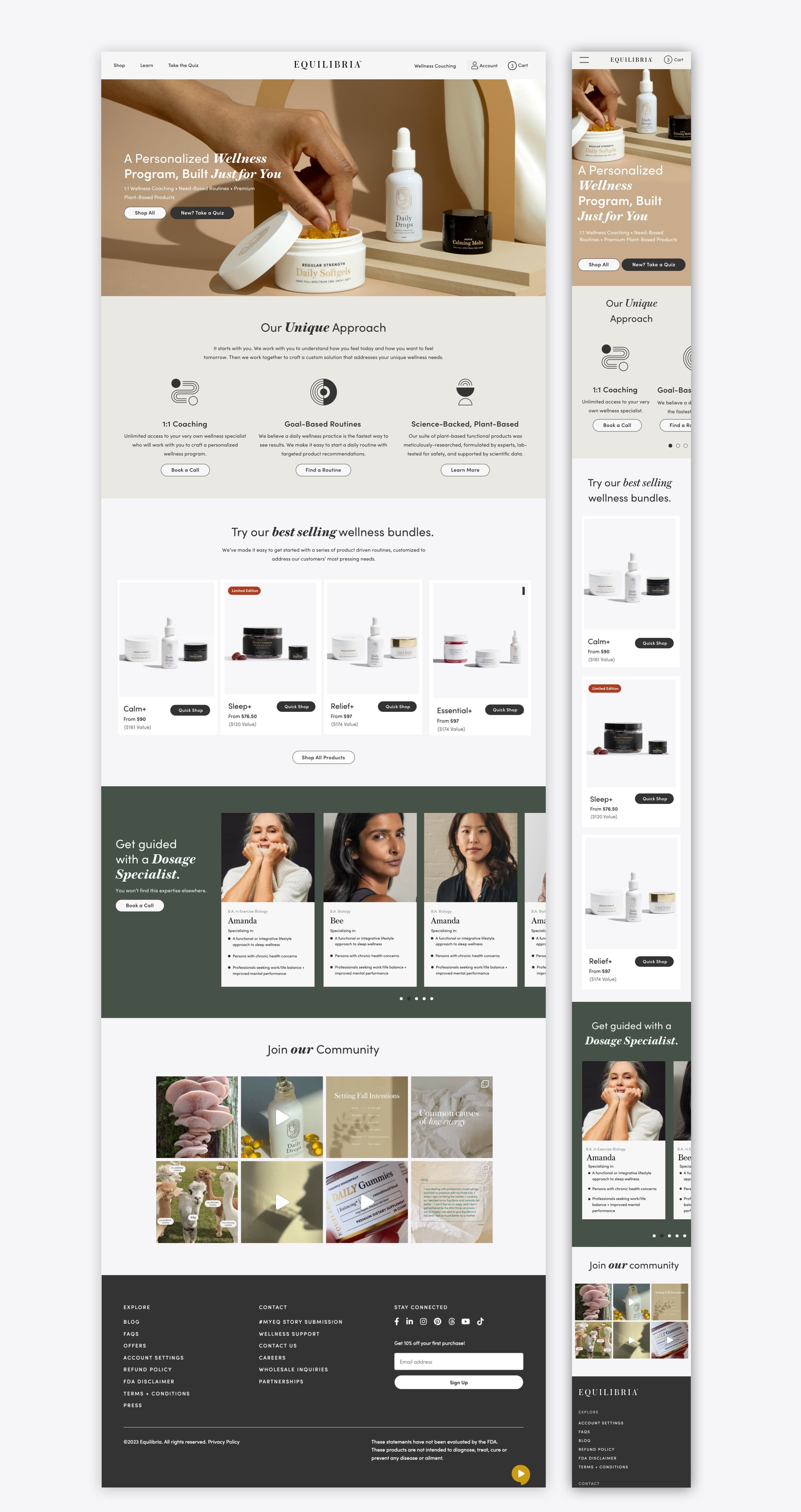
Equilibria (”EQ”) is a high-growth, omni-channel premium CBD platform for women. I was brought in as a senior UX/UI + Product Designer to redesign the web experience—revamp the products aesthetics, improve UX opportunities and design an accompanying personalized digital journey for the 3 general types of visitors: newbies to wellness and EQ, those who are more familiar, and those who are well-informed.
Process involved:
Competitive Analysis, User Flows, Wire Framing, User Research, Visual Design, High-Def Mocks, Art Direction
Design goals (high-level):
Increase product discoverability. Improve mobile web usability. Bring service & personalization front and center. Scalable user friendly design that will resonate and establish trust.
Design & Productivity Tools:
Sketch, Zeplin, Invision and Notion

Learning about the existing platform and brand.
Before I got started on explorations, the head of creative, key stakeholders, the director of product and I got together to revisit the existing design system. As EQ’s first senior product + UI designer, I led a workshops with the content strategists, and engineers to discuss pain-points, roadmaps, and department goals. Getting the team comfortable talking about improving product features and visual style while staying within the brand perimeters and platform restrictions.

The Design Process
After reevaluate their entire shopping experience and mapping out the user journey I went head down to solve for turning their high volume influencer driven visitors into customers—presenting the product with clarity so the user understands the product and services. I set up my high level design goals and started iterating ideas. Revisiting the navigation system, refreshing the existing modular blocks that would accommodate future expansion of the product (for site content and marketing landing pages) and one of the biggest EQ challenge, updating the checkout flow.
Design Direction
I strived to establish a strong verbal and visual information hierarchy across all the pages. Pulling from the brands existing vibe I aimed to create the skeleton for messaging that centers on the customer’s needs—and not overthinking or complicating it. The placeholder content, art and overall design aesthetic was my new direction for the brand. Staying close to language and assets EQ already had but finding ways to push it a further.

To understand the visitors needs and generate a personalized plan.
I believe a well-crafted pages attracts and converts users. User-centric design builds trust and credibility. In addition to these core UX values, I focused on good interactions and information hierarchy to boosts retention, make sure to add reviews to help influences consumer decisions. Optimizing assets to minimize abandonment by reducing page speed and load time frustration, improve their quality, and ensure their compatibility with different devices and browsers.
In additions to good UX and clean UI to influence the mood, messaging, and usability of the website. It was very important for the product to stress the importance of a daily routine. The PDP pages (curated bundles and single sku’s) is where I prioritizing educating the visitor. I had already started sprinkling the idea of personalization at multiple touch points but honing in on a set routine, product pairings and the dedicated team for 1-on-1 personalized dosage counselors was very important to be stressed at the product level since there was a lot of traffic being driven to the product pages, especially the bundles pages that also acted as marketing landing pages for launches and proportions.


Personalization to better understand EQ’s audience.
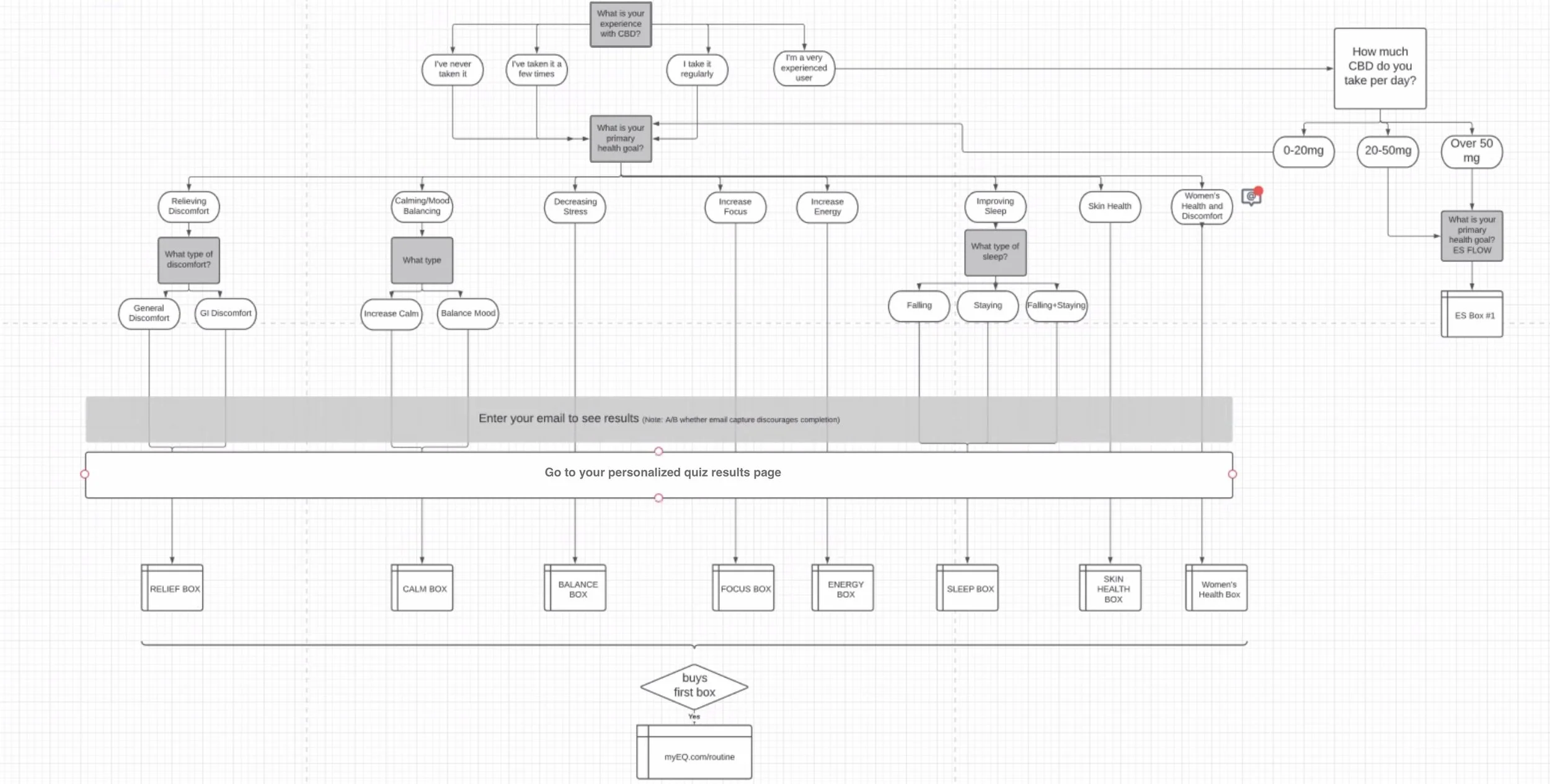
To begin designing a website, it’s important to understand your audience. While conversations of larger scope projects were still developing (like the pdp redesign above), I focused on getting to understand our audiences' needs with a mini personalization project. To start I fleshed out a member journey map with all the guided selling and service touch points then mapped out all the routine permutations for the quiz results.

Customer/Member Journey Map

Quiz Routines Map
The quiz helped determine the optimal layout, content, and functionality of the website. The results and post purchase “routine’s page” provided the visitor with a suggested daily routine to be accompanied with a 1-on-1 dosage call with EQ’s highly qualified dedicated dosage counselors. Guiding visitors to a well designed experience on the site was a good test and a nice quick win for the product + dev department. It increased conversion and retention by 12%. In addition to helping achieve business goals, the quiz was the pathway to further personalization features (planting the the seed for EQ’s counseling services in the accounts dashboard). The tertiary goal here was to start iterating for the beginnings of a member community.

Using metrics and data to justify UI/UX decisions.
GA’s funneled segments to track quiz performance showed that 10.85% of new visitors to the site started and converted. 13.73% of new users completed and converted with an AOV of This was more than the quarterly 5.56% conversion rate with a $91.10 AOV vs the overall $77.80.
Using google analytics to track key performance indicators such conversion, bounce, click and retention rate helped product and tech prioritize site updates and new features. And the collected data showed that along with a growing conversion rate due to the new personalization feature there was a cart and checkout abandonment was at its highest. The V1 redesign of the checkout flow (designed and rolled out along site the new personalization features) was successful at establishing a consolidated vertical scroll but was still cumbersome based on the exit rate
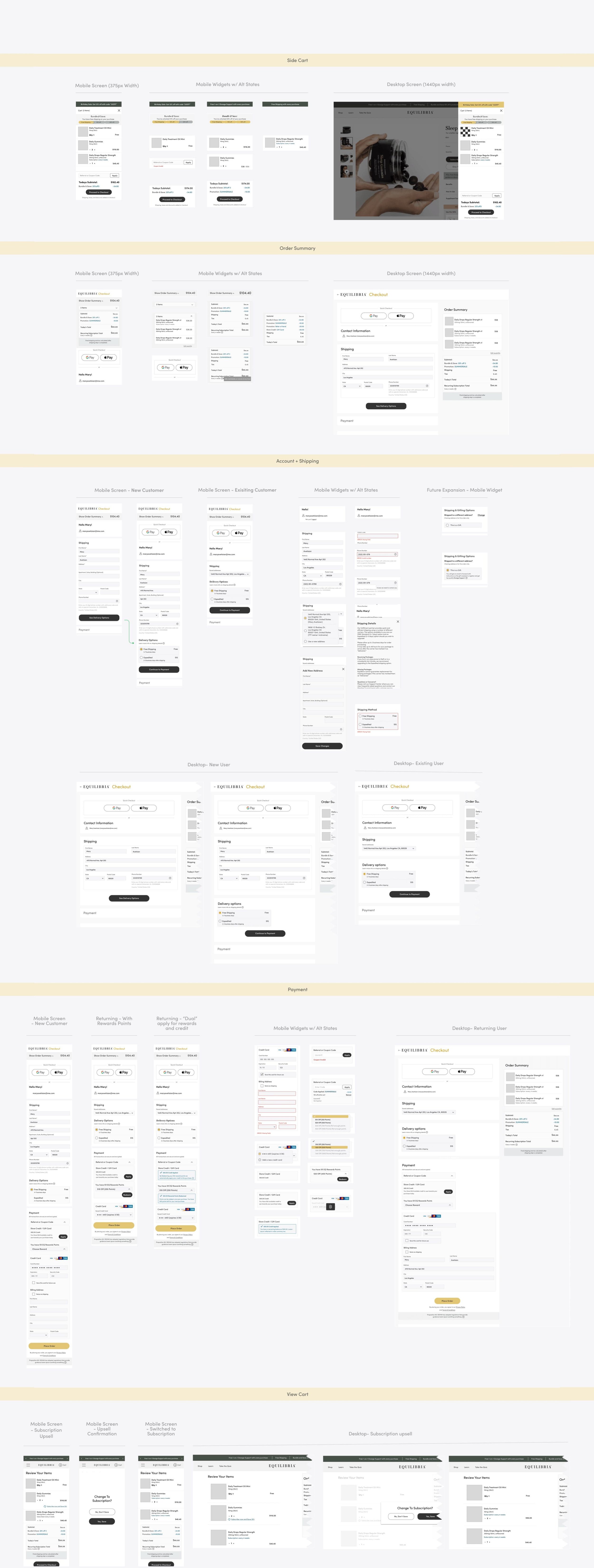
Analyzing user behavior (rage clicks, time spent on page customer customer scrolling videos) and doing my own UX research—not just UX testing in individual cases, but rather examining similar projects and borrowing or learning from their solutions. It was clear that the next iteration of “Eq’s” checkout experience should focus on removing any distractions and confusion. Simplifying and modularized the checkout process to increase usability, especially for mobile.

A guided experience
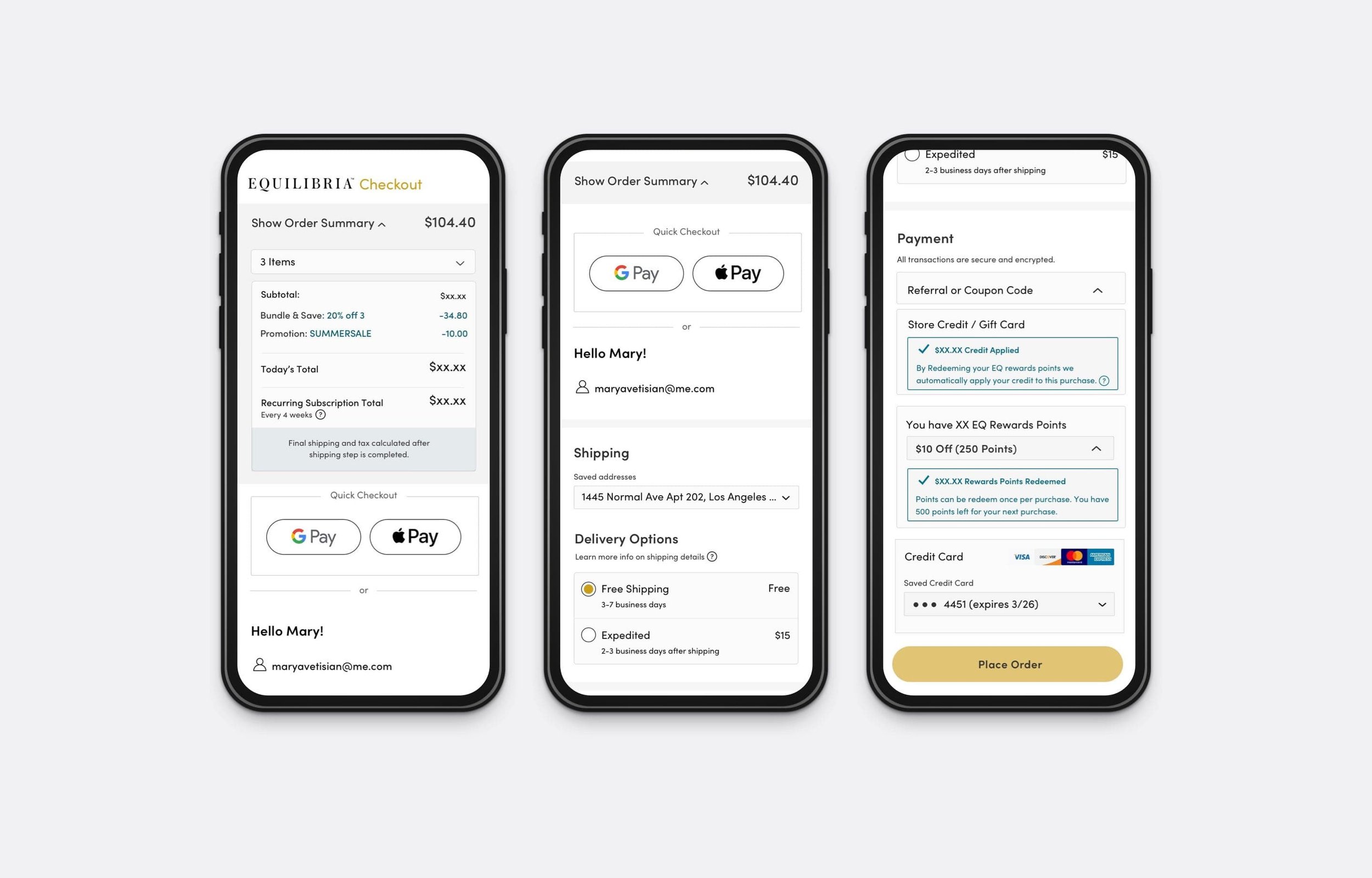
The high level design goal for decreasing checkout abandonment, acquiring new members, and reducing checkout related support tickets was a a multi-page flow with a very clear section-by-section verification process. Prioritizing: (1) Engineering initiatives to reduce page load and checkout time. (2) Loyalty redemption functionality. (3) Promotional discounts, two or more coupons functionality. (4) Seamless input fields, dropdown widgets, accordions and pop ups. (5) Refined error and success messaging and functionality.

Next Project